About the Game's Graphic (Tilesets)
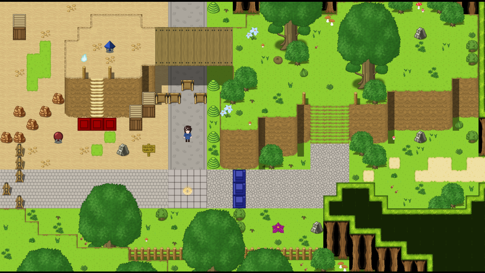
One thing I always thought about is drawing the tilesets myself so they better fit the rest of the game and give it a more unique look. It also would give me more freedom in making the maps look more visually distinct and interesting as I am not limited to the default graphics anymore.
As some of you may know that the tilesets I use are mainly part of the common rpg maker license. (Meaning everyone can use them if they own the rpg maker mv license.)
Which is good but also means that most rpg maker games look kinda same since a lot of games use the default tilesets and sprites.
So I gave it a try and remade a few tilssets to see how it would look and what you see is the result of my first try. All of the selfmade tilesets here are a work in progress since I never made tilesets before and defintely can be improved on. Trees definitely could use more shading and there are a few stray pixels here and there.
Feedback about this is very welcome on what you think about the look and if you would prefer it over the default tilesets. Suggestions or ideas are also welcome.
Currently I have not decide if I plan to replace all tilesets with selfmade ones since the workload would be immense. Maybe a thing to consider after the game reached version 1.0.0.
For now I will focus on adding content to the game.

Get Adventure of Changes
Adventure of Changes
A SFW turned based rpg with a heavy focus on transformation.
| Status | Released |
| Author | Furandre |
| Genre | Adventure |
| Tags | 2D, Experimental, Fantasy, Female Protagonist, Pixel Art, RPG Maker, Singleplayer |
| Languages | English |
| Accessibility | Subtitles, Configurable controls |
More posts
- Version 1.1.42 days ago
- Version 1.1.376 days ago
- Version 1.1.285 days ago
- Version 1.1.186 days ago
- Game Crashing Memory Bug88 days ago
- Full Version Release!95 days ago
- Full Version Release DateJan 27, 2025
- New Pulbic Version 0.9.2Dec 20, 2024
- Game Development Log 12Nov 22, 2024
Comments
Log in with itch.io to leave a comment.
Actually looks really good I applaud the detail it's great
Thanks^^
It certainly is a thing I would like to do after version 1.0 of the game is finished if enough people are interessted!